
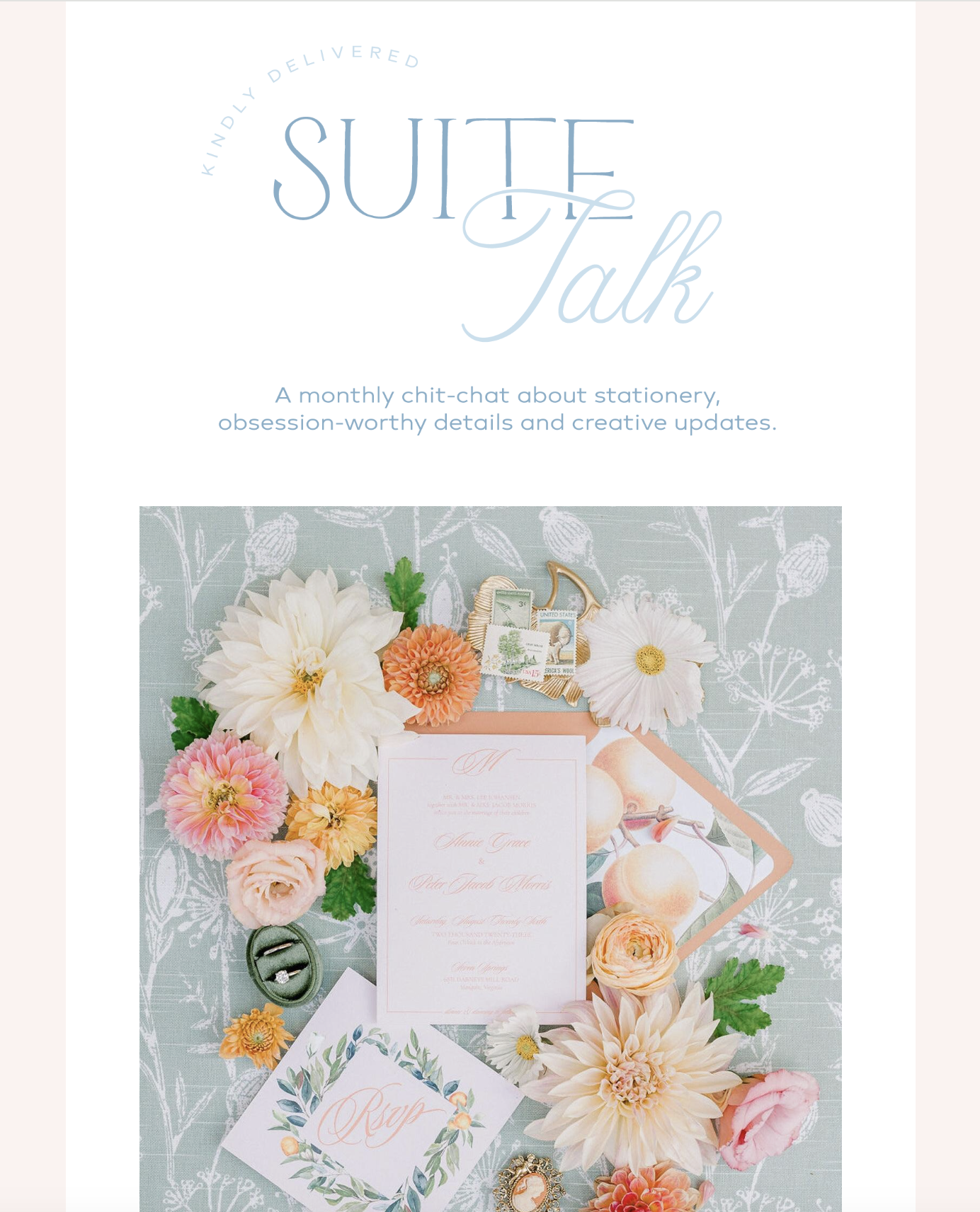
In the ever-evolving world of branding, it’s essential to stand out from the crowd and establish a unique identity for your business. As a female entrepreneur DIYing your brand, finding the perfect color palette is a crucial step towards crafting a visually appealing and cohesive brand image. What better inspiration than the captivating and iconic eras of Taylor Swift? Known for her musical prowess and evolving styles, Taylor Swift’s eras provide a wealth of inspiration for designing color palettes that resonate with your target audience. In this blog post, we’ll explore some Taylor Swift-inspired color palettes that can help elevate your brand identity and make a lasting impression.
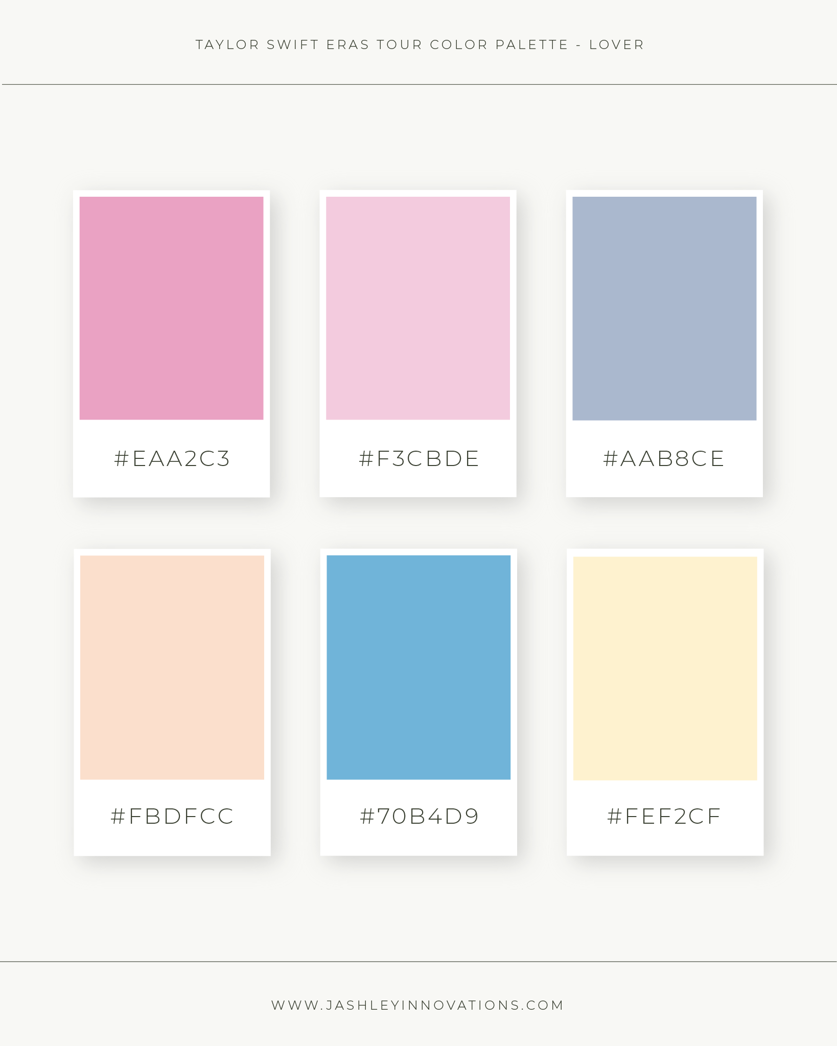
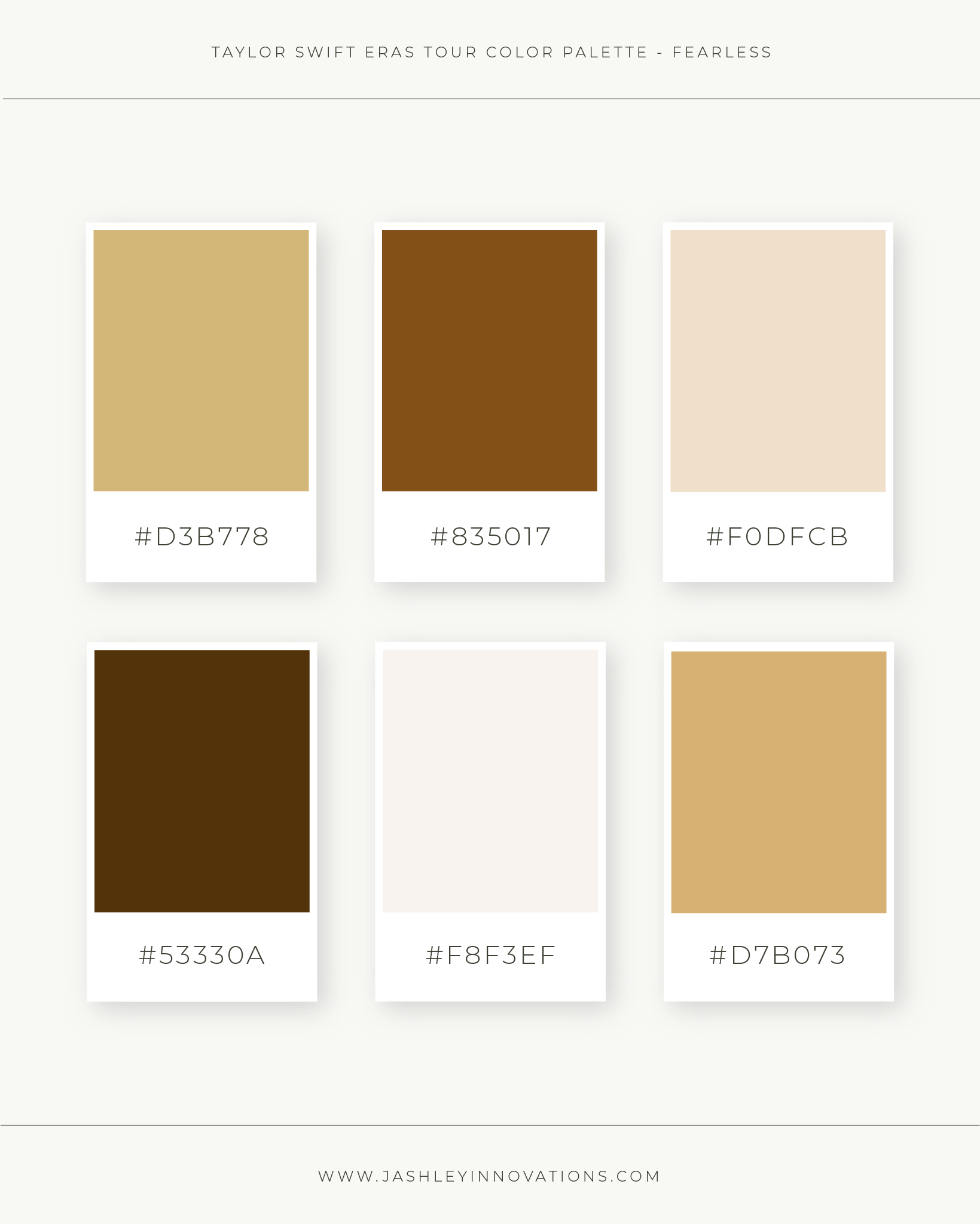
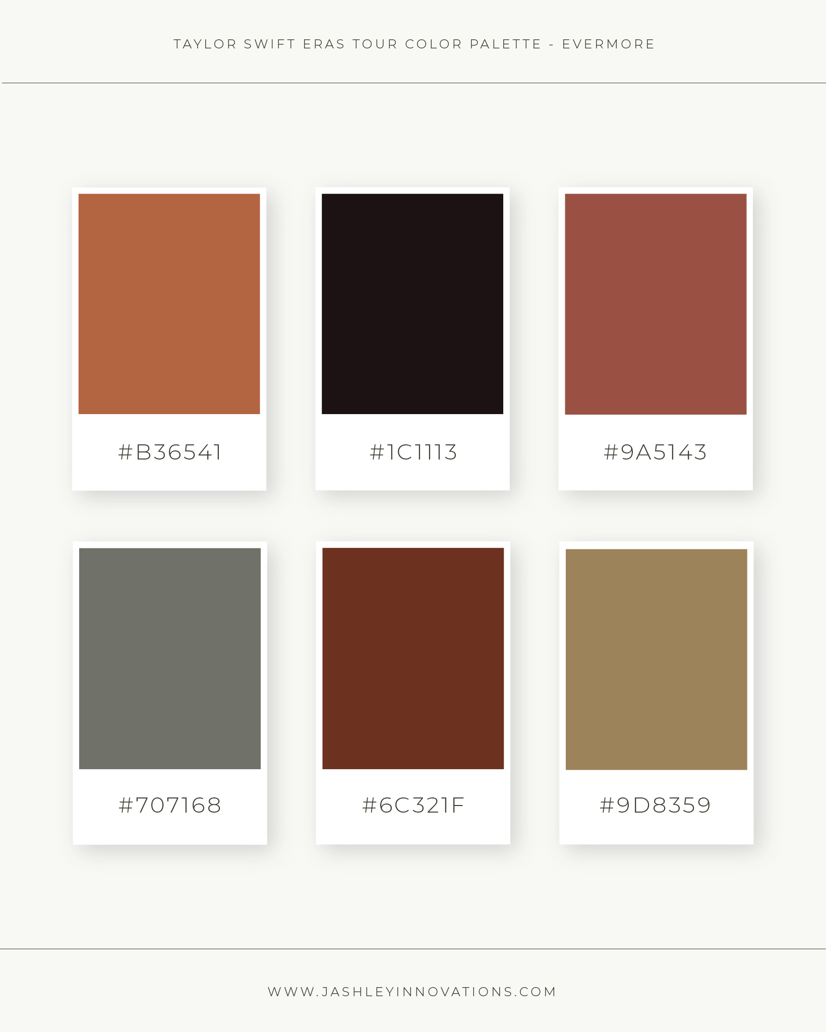
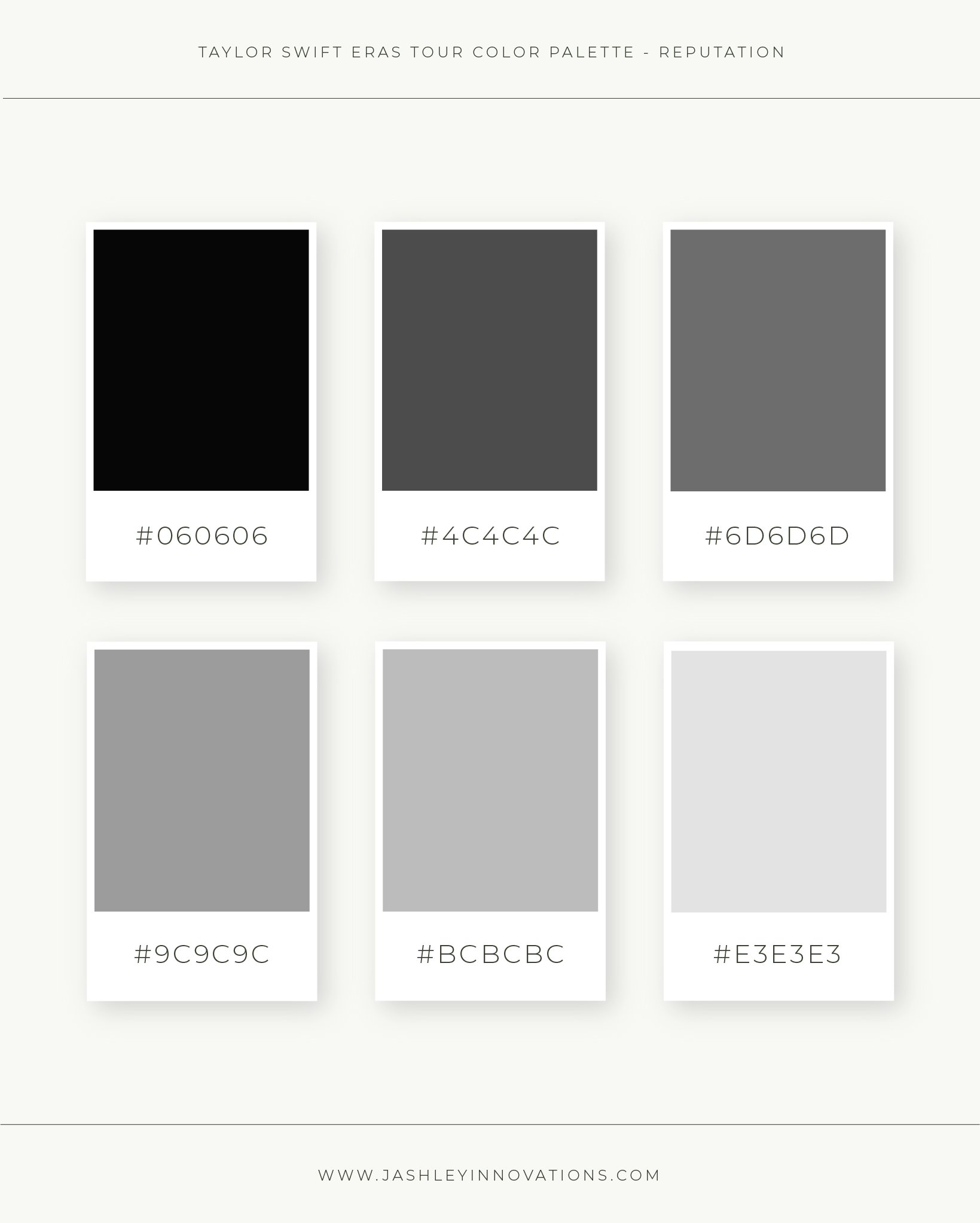
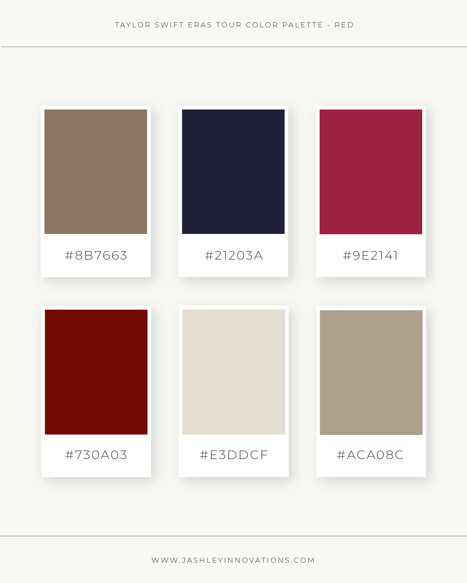
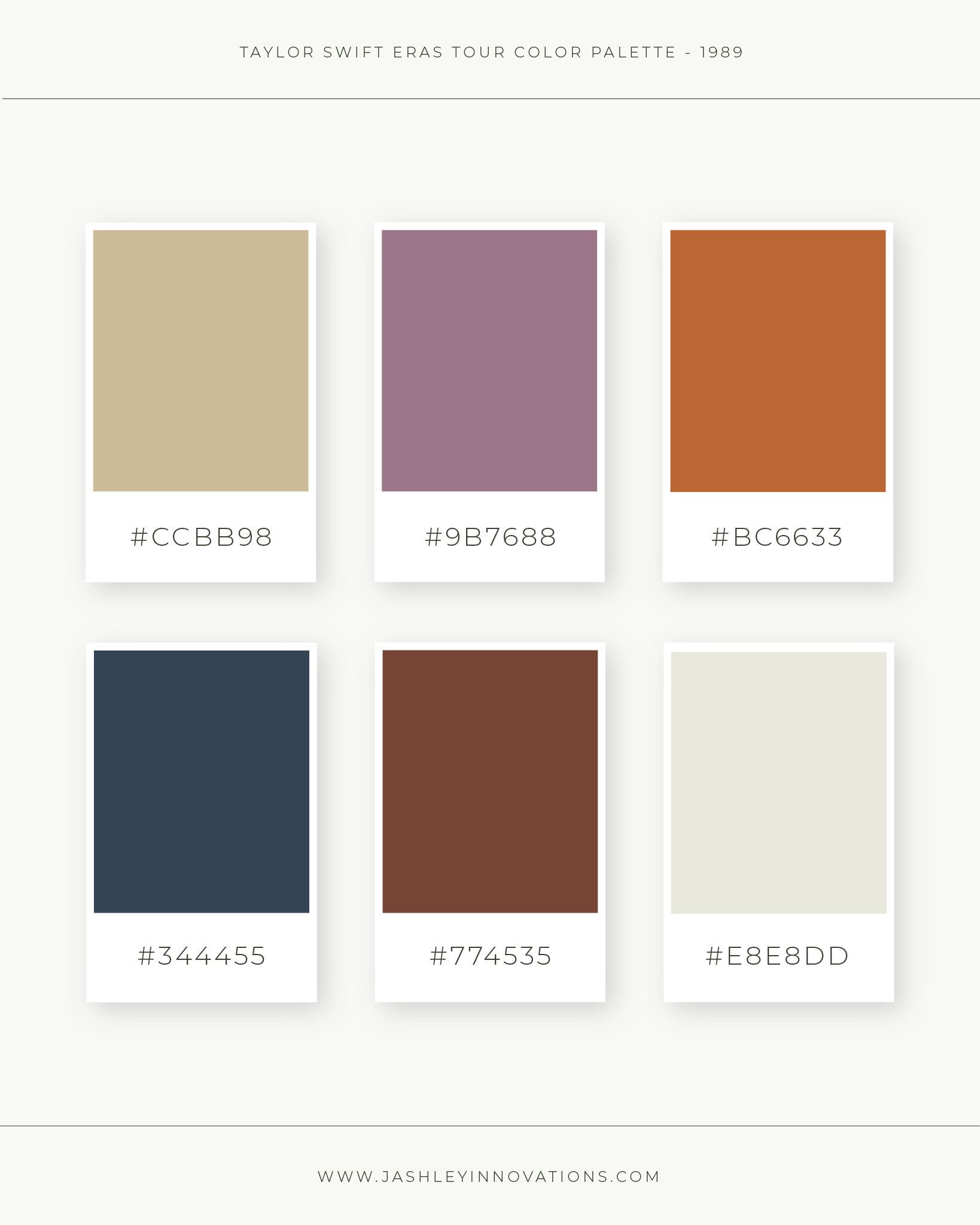
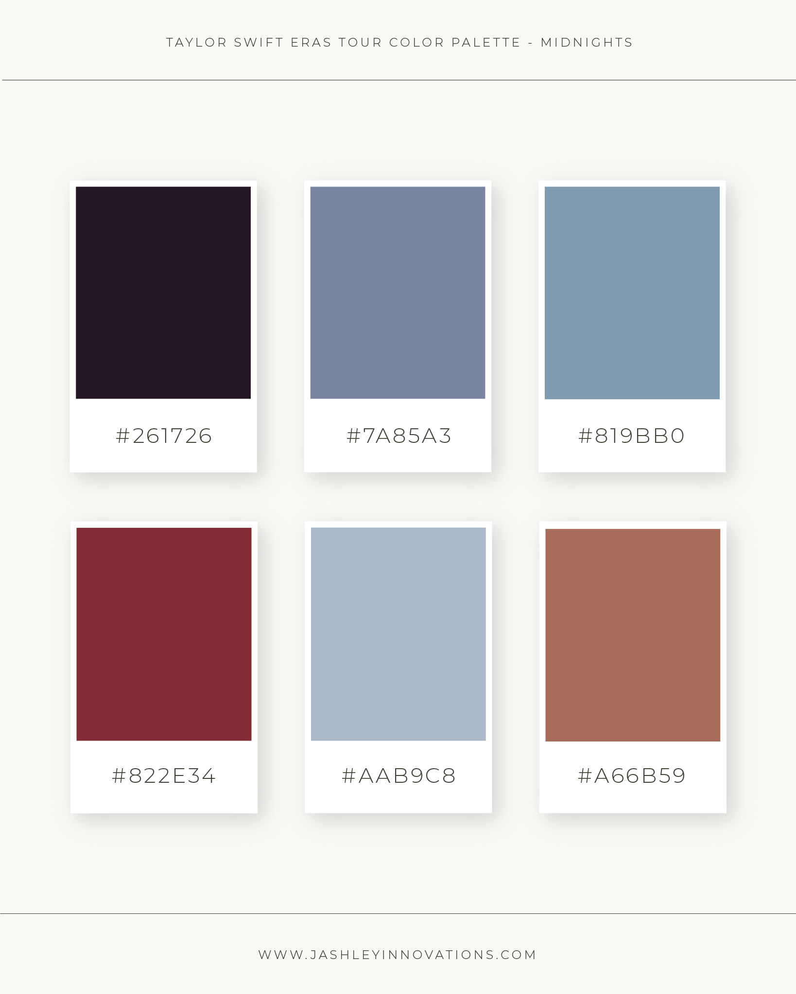
As a female entrepreneur DIYing your brand identity, it’s essential to create a visual representation that resonates with your target demographic. Drawing inspiration from Taylor Swift’s iconic eras, you can craft unique and captivating color palettes that elevate your brand image. Whether you choose the golds of the Fearless era, the rich tones of the Red era, the mid-century hues of the 1989 era, or the moody elegance of the Reputation era, these palettes offer endless possibilities for expressing your brand’s personality and values. Remember, color has the power to evoke emotions, convey messages, and create memorable experiences. So, embrace the magic of Taylor Swift’s eras, and let your brand shine with a color palette that leaves a lasting impact.
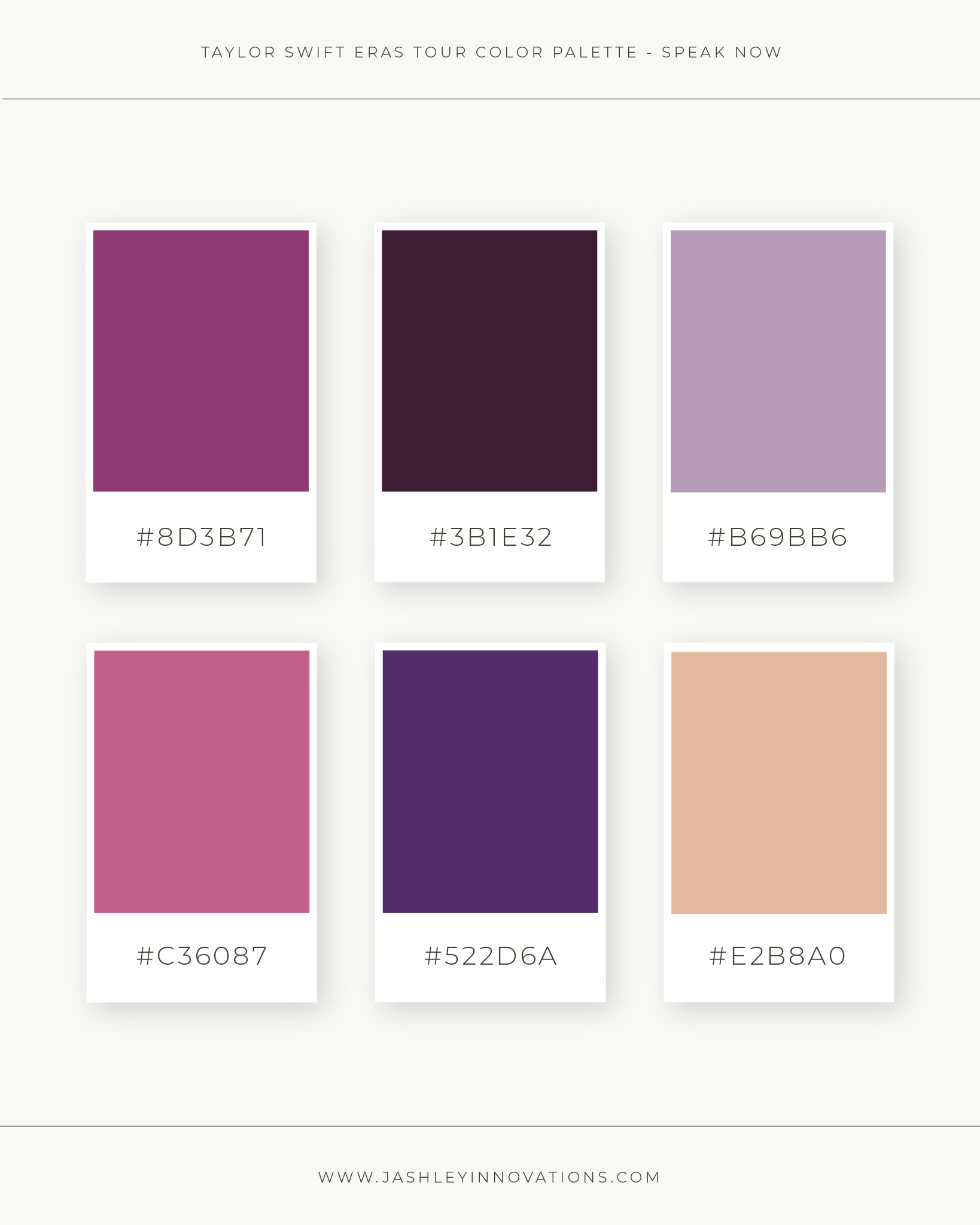
Which one of these color palettes is your favorite? Mine is Speak Now, which is fitting because that’s also my favorite album!


Hiiii, I’m Jordan!
THE GIRL BEHIND THE brand
Beige, boring, and toning yourself down in your business? Not around here! Because with a brand that embraces color, you’ll start owning your boldness, your uniqueness, and everything that makes you, you in your business.
Brand and Showit website designer for color-drenched high-end brands
Here’s how we can work together
Full-service branding, copy, SEO, and a one-of-a-kind Showit site that books more of the clients you’re dreaming of.
Perfect if you’re not quite ready for a full new website, but still want an elevated “OMG, that’s so you!” feel.


