3 Website Updates you Need to Make Before Wedding Season
March 8, 2023
For some people, March means temperatures are rising, birds are chirping, flowers are blooming, spring is coming. But for wedding professionals, March means you’re gearing up and hunkering down for busy season. And busy season means you’re most likely not going to touch your website again until July ? amirite?
But have no fear, friend! I’m going to help you get your website ready for busy season so your website will continue attracting dream clients (even when you’re not thinking about it).
No. 01 – Update images throughout your website
I know you had some absolutely STUNNING weddings last year, so instead of just using the images on your social media, update your website with them! While newly engaged couples are browsing websites to hire for their big day, they’ll be able to envision working with you so much easier if what you’re showcasing speaks to them (instead of just using images from your 2021 weddings because you hate updating your site). Here are a few specific places you should make sure to pay attention to…
Your home page
This should go without saying, but I’m going to say it anyways, your home page needs to be more than just a photo dump of your favorite weddings’ images. Should it showcase the best of the best of your work? ABSOLUTELY, but you need to be strategic in what you select, and include copy that will hook your potential couples.

For example, take Haley’s home page. The first thing you see on her website is a stunning horizontal photo she took that shows the type of weddings she wants to continue to attract. This is paired with copy stating what she does and where she does it, which is just as important as the first image you see!
Below she immediately introduces herself so her potential couples know who they’d be working with and an actual brand photo (we’re leaving iPhone pics that your husband took in your backyard in 2022, okay?) Let this serve as a reminder that you should have true brand images for both your website and your marketing!
Your home page imagery should make the viewer want to continue scrolling to get to the meat of your website (where all the good info about working with you is) and Haley did an excellent job selecting photos that do that!
Your about page
Continuing the train of thought that you need actual brand photos…let’s talk about why you need more photos of you than you think on your About Page! I’ve had clients tell me in the past that they don’t like showing their face on their social media or website for their business. Trust me, I get that it can be uncomfortable, and sometimes even feel conceited, but today’s couples want to know who they’re working with, and basically everything about them, more than ever! Most couples in 2023 are looking for vendors that they can become friends with, and form connections with, long after their wedding day. So how do you do that when you don’t even know these people exist yet? With images and copy ?
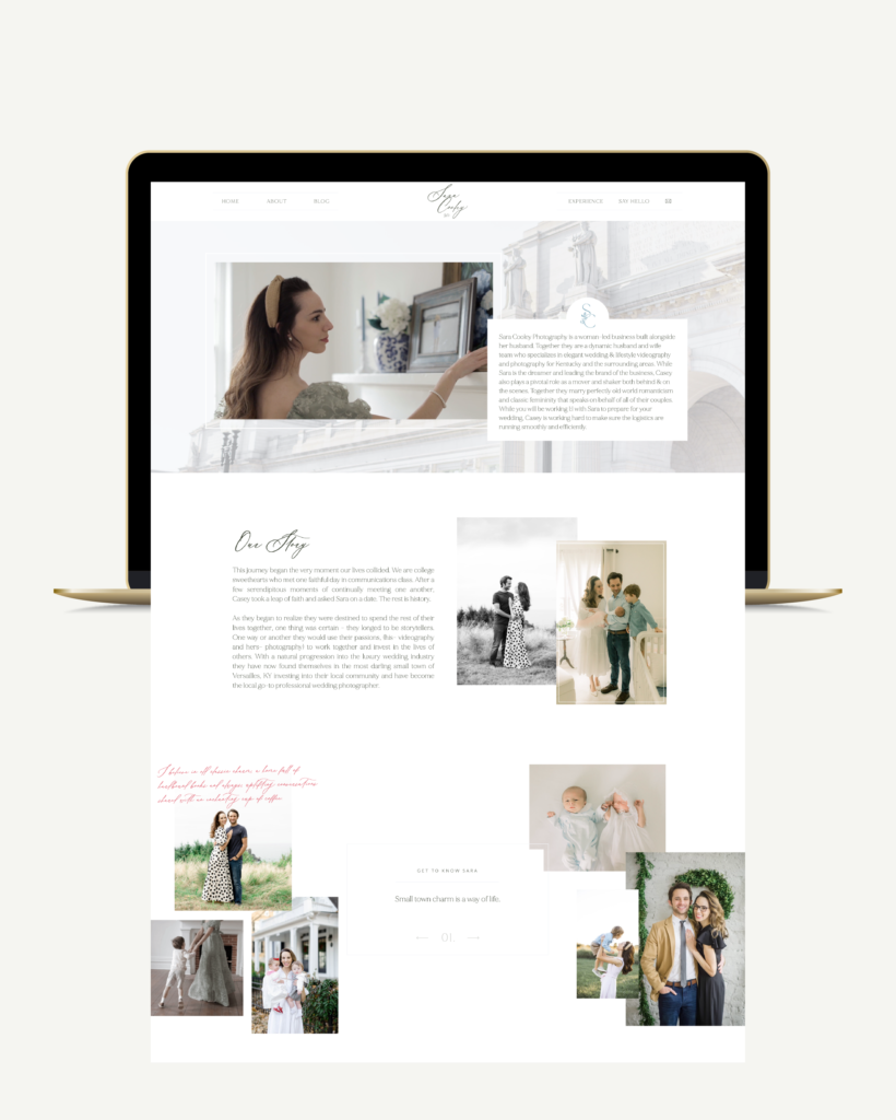
Let’s look at Sara’s about page. First of all, look at how stunning she is! Now look at how much there is actually about her on this page. She’s got images (of herself and her family, because her family is a crucial part of her story), video (talking straight to these dream couples she wants to attract), and tons of bingeable content that viewers can read through if they want to know even more about her.
Your about page imagery should showcase your personality, not just stiff headshots or iPhone photos in front of your white living room wall. You should be just as intentional about photos (and videos) of yourself as you are about photo/video of the weddings you work. Reach out to your favorite photographer (maybe she’s a friend you’ve made at past weddings, or maybe she’s someone you’ve dreamed of hiring one day) and have a full out brand shoot! In my opinion, investing in quality brand photography is just as important as investing in a website designer.
Your experience or investment page
I tell every single one of my clients that they should keep their portfolio images on the same page that they talk about what’s included, what the experience is like, and what the investment is. Nobody wants to have to flip back and forth between multiple pages to see examples of the package they’re considering in action.
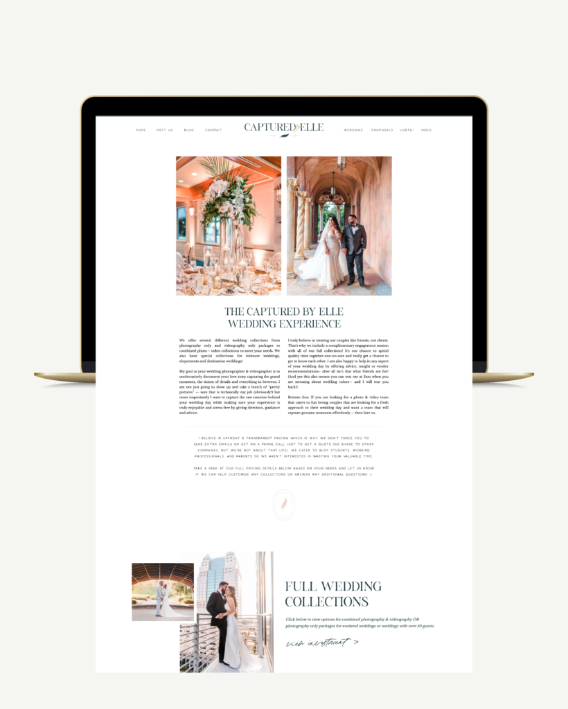
Elle’s investment page is probably the most thorough I’ve ever designed, and I LOVE IT. She showcases all of the collections she offers, with a brief blurb and images all in one place. If you want more info, you click “view investment” and the details pop up right there on the same page! This keeps everything clear and information, while still remaining in one place.
The images on this page should correlate with the packages. Make sure you’re not showcasing your highest price florals next to your lowest price package ? we don’t do misleading around here, friend! You want your potential couples to feel confident in the package they’re selecting and knowing that they can receive the results that are pictured!
No. 02 – Update your pricing
If you truly want your website to continue to capture leads for you while you’re too busy to be doing the marketing yourself, your prices must be updated and accurate. If you have potential couples reaching out to you based on 2022 pricing for their 2024 wedding, you’re going to lose their trust and they’re not going to book you for their big day, OR, you’re going to stick to your old pricing and end up resenting the couple or the wedding because you’re not getting paid what you should be. It’s a lose-lose situation, and updating your pricing takes just a couple of minutes. (PS- I walk you through how to price services for your wedding biz profitably while maintaining balance in your life here).
I’m a firm believer that your pricing should be included somewhere on your website. At a minimum this looks like “Starting at $XXX” like I have in my contact form, or like Emily has on her experience page.
No. 03 – Refresh your blog
I know, cue the groans. In 5 years of working with wedding professionals, I’ve found there are two kinds of people: those who LOVE blogging and those who hate it. If you’re one of the ones who loves blogging, then great, get to it!
If you’re one of the ones who hates blogging, kindly get over it. ?
Blogging does so much for your wedding business that you don’t even realize! It helps with SEO (getting found on google), it helps you showcase your favorite weddings, it helps you talk to potential couples about your role in a wedding, and even provides them with free, quick wins if you’re giving advice for wedding planning. Aaaand if you happen to be looking for help blogging about your wedding biz, I have a bonus training from Ava and the Bee for you!
For now, go and type up 3 blog posts, and schedule one per month for the next 3 months. You can (and should) do more than this, but this will at least help keep your blog up to date! Here’s what I recommend while you’re in the depths of busy season:
- 1 blog post about venues you love in your area (free, quick wins for potential couples)
- 1 blog post about the dreamiest wedding you worked in 2022 (showcasing your BEST work and sharing about your role in the wedding)
- 1 blog post about something in your personal life or owning a wedding business (personal, gives the viewer a peek into you beyond that thing that you do)
So there are my tips to help your website as you head into your first busy season of 2023! If you have any questions, shoot me a DM, and I’d be happy to talk through it with ya, friend!
Ready to create a brand and website that feels so you?
Whether you’re dreaming of raising your rates, booking those heck yes clients, or finally having a brand that makes you feel like the powerhouse you are—I’m here to make it happen. No more DIY frustration or settling for “good enough.” Let’s build something that’s unapologetically you and completely unforgettable.

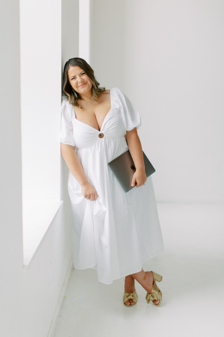
Hiiii, I’m Jordan!
THE GIRL BEHIND THE brand
Beige, boring, and toning yourself down in your business? Not around here! Because with a brand that embraces color, you’ll start owning your boldness, your uniqueness, and everything that makes you, you in your business.
Brand and Showit website designer for color-drenched high-end brands
meet jordanHere’s how we can work together
Full-service branding, copy, SEO, and a one-of-a-kind Showit site that books more of the clients you’re dreaming of.
Perfect if you’re not quite ready for a full new website, but still want an elevated “OMG, that’s so you!” feel.
I know you're ready to take your business to the next level...
Think how much easier it would be to attract clients and create a brand that gives you a sense of peace and freedom that no corporate job ever could. You, my friend, would be the creative force your industry needs.
YOU WON’T FIND “DRY” AROUND HERE
© j. ashley innovations® 2018- | Terms and conditions | privacy policy

