5 Creative Ways to Incorporate Your Brand Colors on Your Website
May 30, 2023
As a female service provider, your website is a powerful tool to showcase your brand identity and attract your target audience. An incredibly effective way to create a visually appealing and cohesive online presence is by incorporating your brand colors throughout your website!
Let’s dive into five creative ways to infuse your brand colors into your website design, allowing you to make a lasting impression on your potential clients. Aaaaand because I’m extra (?) I’m going to briefly introduce the importance of color psychology and how it can impact user experience!
First, let me introduce you to my dear friend, color psychology! It might sound scary, but it’s essentially the emotional impact of different colors and select hues that align with your brand identity. For instance, warm colors like red and orange can evoke passion and energy, while cooler tones like blue and green convey calmness and trust. By understanding the psychology of colors, we can use them strategically to create an immediate connection (and build trust) with your dream clients!
01 – Hero Section
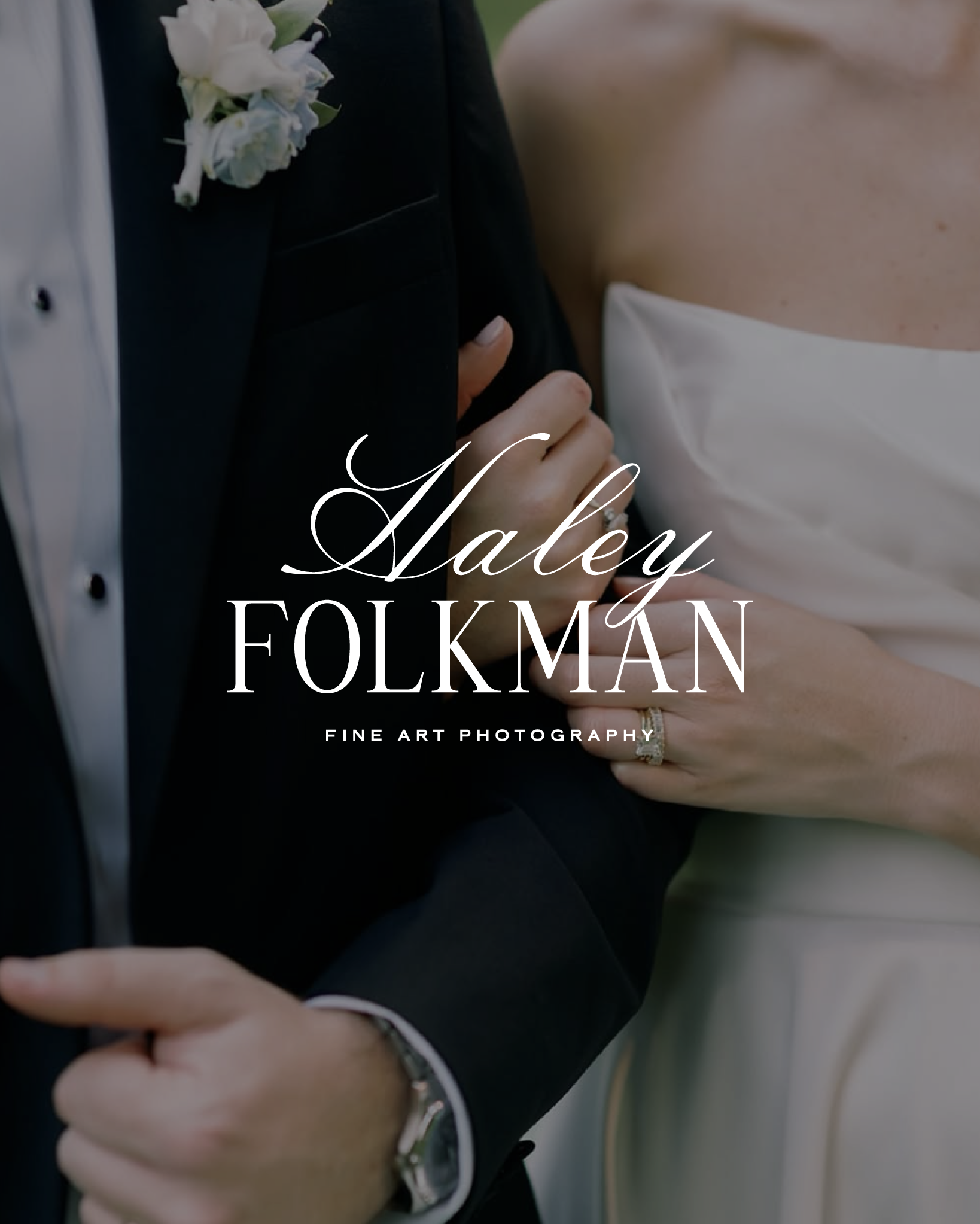
The hero section of your website is the first thing visitors see, making it an impactful space if you incorporate your brand colors strategically. Use your brand colors strategically in this area by incorporating them into the background, typography, and call-to-action button. A bold and vibrant hero image that captures your brand colors will instantly catch the attention of your audience and set the tone for the rest of your website!
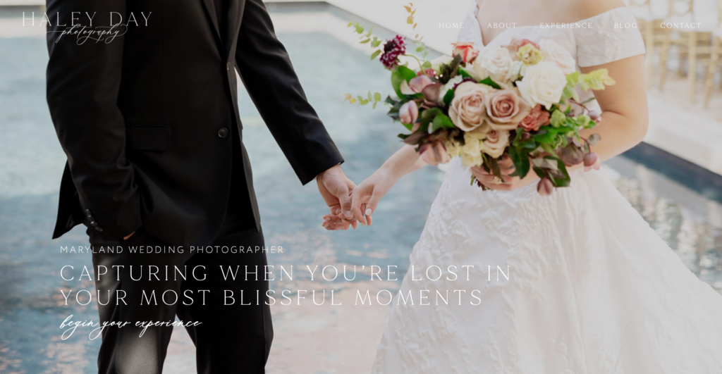
Below is a great example from a custom brand and Showit website I designed for Haley Day Photography. You get a glimpse at her brand through the fonts, her logo, and the colors in the image, so you know that you’re looking at a luxury wedding photographer’s website!
02 – Colored Typography
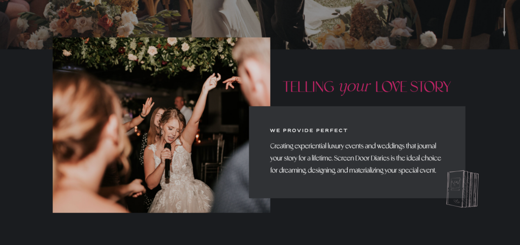
Goodbye black text on a white background! Your typography (AKA the words on your website) not only serves a functional purpose, but also contributes to the overall aesthetic of your website. When choosing which of your brand colors to use for your typography, consider the readability and legibility of the text. Experiment with different combinations of font colors from within your brand’s color palette, while ensuring optimal contrast for easy reading. For example, white, or a vibrant brand color text with a dark background can create a visually striking and engaging experience for your website’s viewers.
Take a look at this website I crafted for ScreenDoor Diaries. Your eye is instantly drawn to the magenta heading, then naturally falls down to the text below. The contrasting white typography is easy to read, and different from what you typically see. This website showcases her brand so well!
03 – Accents and Icons
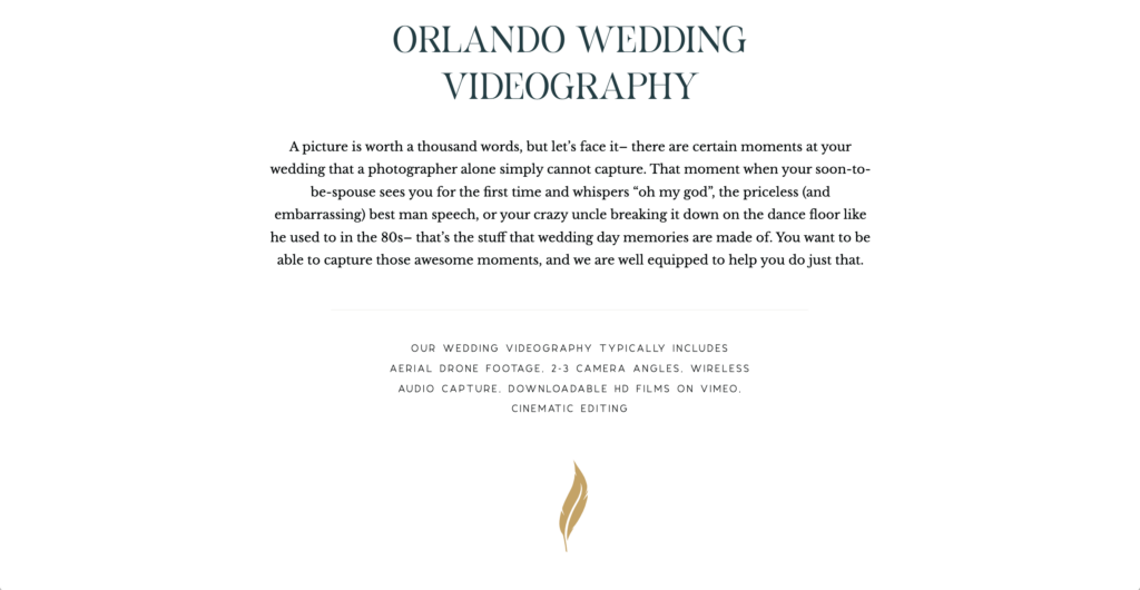
Using brand colors for accents and icons throughout your website helps to establish a consistent and cohesive visual identity, which is always the goal when you invest in a brand and/or website! Either utilize graphics that your brand designer created for you, or select icons that align with your brand aesthetic and apply your brand colors to enhance their impact. These small design elements contribute to a seamless and engaging user experience, reinforcing your brand message.
For example, the website I designed for Captured by Elle shows her feather graphic beneath the text. This introduces the gold color from her brand palette and brings a text-heavy section to life! Bonus tip, her text is blue to incorporate her brand colors, but dark enough that you can’t really tell it’s not black ?
04 – Buttons and Links
Buttons and links are critical elements for driving user engagement and, more importantly, conversions on your website. Because honestly, why have a website if it’s not converting + bringing you clients/money? ?
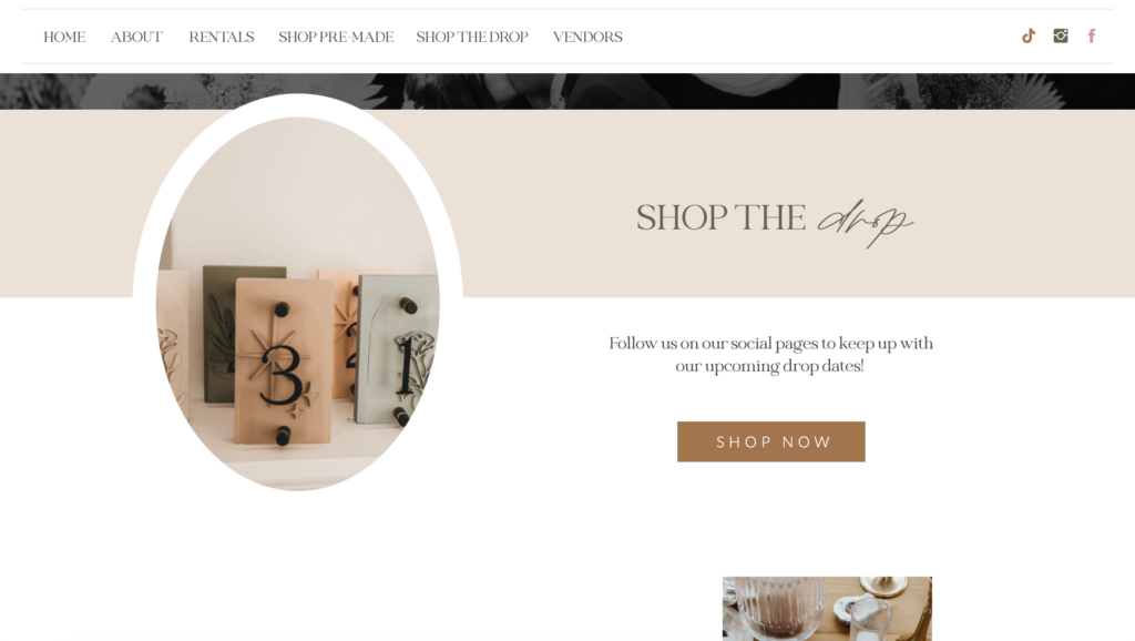
When designing these interactive elements, consider the psychological impact of color. For example, a vibrant and contrasting color for your call-to-action buttons can create a sense of urgency and encourage visitors to take action. Similarly, using your brand colors for links can help establish visual consistency and guide users through your website.
Take Unspoken Designs‘ website below. Besides the beautifully curated mid-century color palette and images that match perfectly, the button I designed grabs your attention pretty quickly. The more bold color in her brand palette helps encourage the viewer to “shop now” which is, of course, the goal!
05 – Imagery and Visuals
Visual content (graphics, images, video, etc.) play a significant role in communicating your brand story and evoking emotions. When selecting or creating images for your website, take into account the color palette of your shiny new brand. Choose images that incorporate your brand colors so that they enhance your brand and website instead of detracting or distracting from it. If you don’t have images that fit the bill, book a brand photography session! You don’t want to put in all this hard work on your website, then have your imagery fail the vibe check ❌
When your imagery, video, and graphics pair well with your brand colors, your website creates a cohesive and immersive experience for your dream clients. If you want to take a step further, consider the psychology of colors in your imagery, and you can elicit specific emotional responses and reinforce your brand message!
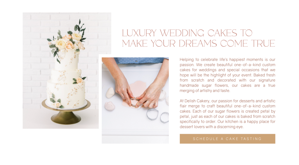
This portion on Delish Cakery‘s home page features brand photos that display beautifully with her brand colors (seen in the text and button color to the right of the images). They aren’t the exact same color, but they pair flawlessly, and the images portray a soft, romantic, luxurious vibe (perfect for potential brides who want a top-notch wedding cake)!
Incorporating your brand colors throughout your website design is an extremely effective way to establish a strong visual identity and leave a lasting impression on your dream clients. By understanding color psychology and applying it strategically (or hiring someone who does and can), you enhance the user experience. From the hero section to typography, accents, buttons, and visuals, each element presents an opportunity to infuse your brand colors and create a cohesive and visually appealing online presence.
Remember that color psychology is a powerful tool, and working with a brand and website designer can further optimize your color choices and overall design. By leveraging the psychology of colors, you can create a remarkable website that captivates your audience, strengthens your brand message, and sets you apart from the competition! And let’s be honest, we already know you produce stunning work, so why not let that show on a beautifully designed website? ?
Ready to create a brand and website that feels so you?
Whether you’re dreaming of raising your rates, booking those heck yes clients, or finally having a brand that makes you feel like the powerhouse you are—I’m here to make it happen. No more DIY frustration or settling for “good enough.” Let’s build something that’s unapologetically you and completely unforgettable.

Hiiii, I’m Jordan!
THE GIRL BEHIND THE brand
Beige, boring, and toning yourself down in your business? Not around here! Because with a brand that embraces color, you’ll start owning your boldness, your uniqueness, and everything that makes you, you in your business.
Brand and Showit website designer for color-drenched high-end brands
meet jordanHere’s how we can work together
Full-service branding, copy, SEO, and a one-of-a-kind Showit site that books more of the clients you’re dreaming of.
Perfect if you’re not quite ready for a full new website, but still want an elevated “OMG, that’s so you!” feel.
I know you're ready to take your business to the next level...
Think how much easier it would be to attract clients and create a brand that gives you a sense of peace and freedom that no corporate job ever could. You, my friend, would be the creative force your industry needs.
YOU WON’T FIND “DRY” AROUND HERE
© j. ashley innovations® 2018- | Terms and conditions | privacy policy
